Growing up in Alberta, Kelly Deck always knew she wanted to live a creative life. She was lured to the West Coast in her early twenties by the ocean, and by the space and diversity here.
“There’s a broad-mindedness and a more liberal perspective,” she says.
Powerhouse Vancouver interior designer Deck has been championing West Coast design since 2002, when she opened an interior décor boutique on Vancouver's
Main Street.
As a young design student, she had an idea about opening a store that could create ceramics and homeware, and when the right retail space became available, she took a leap of faith, ditched school and rented the space.
The bet paid off. Since then, she has become the director of Kelly Deck Design, specializing in high-end custom homes. She has authored a design column in The Globe and Mail, and her HGTV series, Take It Outside, has garnered industry attention and accolades.
Deck executes a disciplined design process, and has a strict, “never go shopping with clients” rule. She says it is because a client will enter a store or showroom with an “everything is a possibility” mentality, while the veteran designer has already vetted numerous options, and has, by the time she goes shopping, narrowed them down to a very few.
“There are so many options out there – if we don’t establish what the parameters are of what you are creating, then one could get so distracted and carried away. And the problem with that, is that if you actually end up executing within those distracted elements – there’s something that feels discoordinate, something that feels wrong.”
“You have to stay in the vessel,” she says, and by that she means eliminating the clutter and playing within the spaces you’ve decided to play.
“It keeps clients on focus. Give them a story – they don’t know what the story is yet,” she says.
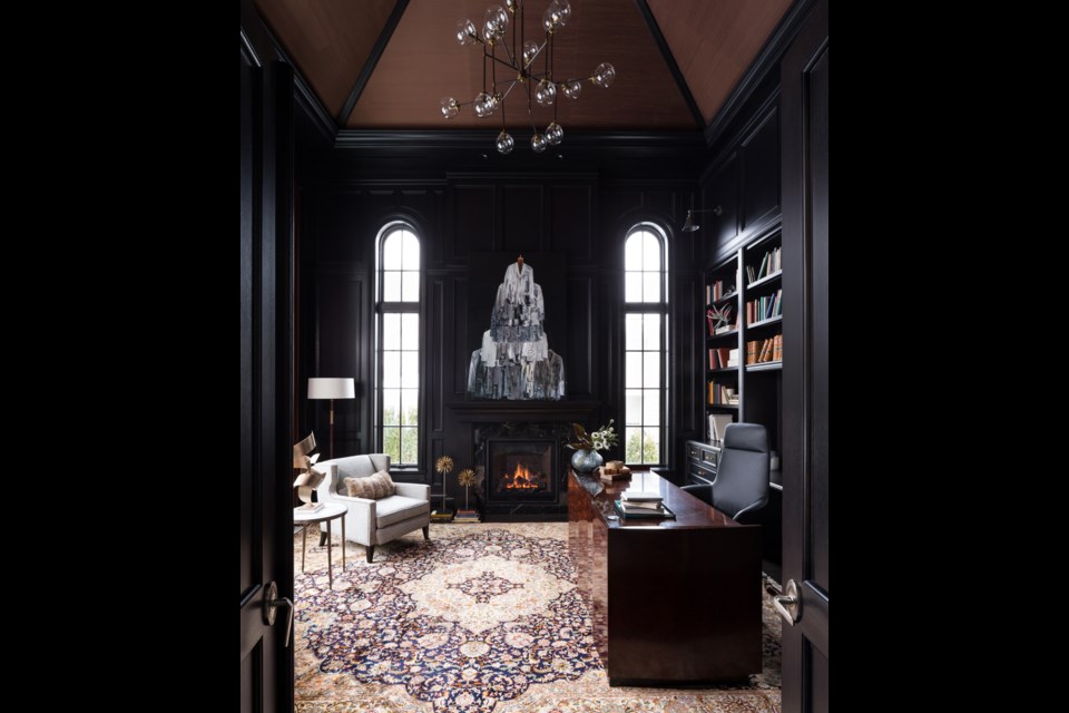
Deck’s recent West Vancouver project stands out as an example of her efficient approach. It was a British Properties project, the client was a developer, and they wanted the property designed for the luxury market, with a classic interior.
“They wanted a combination of high contrast, graphic, contemporary elements, so by and large the interior is a beautiful ivory and black,” Deck remembers. “It definitely got a lot more detail, but hopefully is perceived as classic and timeless. We furnished it in a very spare way that’s sort of bringing a more contemporary approach, as opposed to a ton of layering. Each piece really matters.”
The main floor office is particularly striking, specifically the high ceiling. “It’s about bringing the eye up and creating a sultry elegance,” Deck says. “It had beautiful moldings everywhere, simple, elegant lighting, that wasn’t too ornate. All the ornate qualities were in the finishing carpentry.”
Measuring in at over 10,000 square feet, the home’s foyer has a graphic pattern at the front entry as a focal point.
In contrast to the ebony shades in the office, much of the home features shades of white, which can be tricky. Deck says finding the right white is very specific to the light, and that layering on whites is what makes an interior have depth, as many whites have colour hues.
“On any of our homes, we do boards and test them in the light. One location differs from another — even on the West Coast,” she says.
“The West Coast needs a cooler white than Alberta, because the lighting is very cool,” Deck says. “People always think that you can counteract that, but you don’t counteract it – you go with what it is, because then it seems to come to life in our light. If you try to do a yellow white on the West Coast, it tends to look like a sick colour. Layering white is very important if you have an all-white interior. Layer two or three whites, especially on your walls and your furnishings.”
The main material used for this stunning home was oak, and the majority of the furnishings were from Brougham Interiors.
The arrival of a daughter three years ago upped Deck’s game, because she knew her clients would expect the same level of attention and energy, and that would be a challenge with a new baby. Deck delegates her energy and attention accordingly to manage client expectations.
“There is an intensity to life now that is unprecedented,” she relates.
But the savvy designer is tops at creating beautiful spaces, and knows that beauty is exactly what the discerning are in pursuit of.
“I always say, people with bad taste don’t hire interior designers. Its people who value beauty – who hold it as one of their highest values. They have this innate knowing of their aesthetic and what’s important to them in their interior, but my job is to have the discipline to execute it.”


